Kitchen Colour Trends That Suit Real Homes
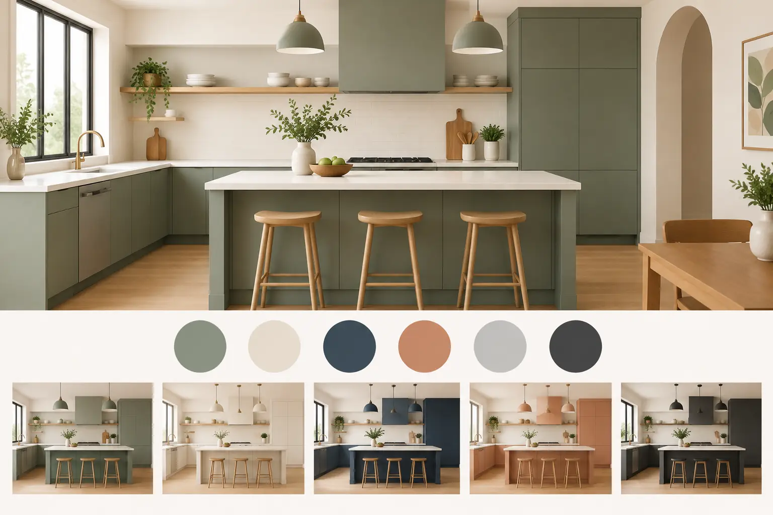
A kitchen can look dated long before its cabinets stop doing their job. If your units are sound, drawers still run properly and the layout works for everyday life, the latest kitchen colour trends do not have to mean removing everything and starting again. A carefully chosen set of replacement doors, a new worktop and updated handles can bring the room up to date without the cost, mess and disruption of a full refit.
The most useful colour trends are not simply the shades seen in glossy photographs. They are the ones that work with the light in your home, suit how you use the kitchen and still feel right after the initial excitement has passed. For many homeowners, that means choosing warmth, depth and contrast with a practical eye on cleaning, durability and budget.
Kitchen colour trends are getting warmer
Cool grey kitchens had a long run, but the mood is shifting towards softer, more welcoming colours. This does not mean every kitchen needs to be beige. It means warmer undertones are taking the place of blue-grey finishes, creating spaces that feel more relaxed and less clinical.
Mushroom, putty, taupe and stone are particularly useful choices for existing kitchens. They have enough depth to define the cabinetry, yet they are gentler than a dark grey or stark white. In a kitchen that receives plenty of daylight, these shades can look calm and tailored. In a darker room, choose the lighter end of the spectrum and pair it with a worktop that has some warmth rather than an icy white finish.
Warm neutrals are also flexible. They can sit comfortably with timber-effect worktops, brushed metal handles and both traditional and more modern door styles. That makes them a sensible option when you want a new look for your kitchen without needing to replace every surrounding finish at the same time.
Greens with a natural, lived-in feel
Green remains one of the strongest kitchen colours, though the bolder, very dark bottle greens are now joined by softer alternatives. Sage, eucalyptus, olive and muted moss tones bring character while remaining easy to live with. They work especially well in Shaker-style replacement doors, where the framed design gives a painted-look colour extra presence.
A pale sage can make a compact kitchen feel fresh without looking cold. Olive and deeper muted greens are better suited to larger rooms or kitchens with good natural light, particularly when balanced with a lighter worktop and pale walls. If your kitchen is north-facing, take samples home before deciding. A green that looks gentle in a showroom may appear greyer or darker under your own lighting.
Green is a good choice for homeowners who want more personality than neutral cabinetry offers, but do not want a colour that dominates the room. It also pairs naturally with warm brass, aged bronze and black handles, depending on whether you prefer a softer or sharper finish.
Blue is becoming softer and more considered
Blue kitchens have not disappeared, but the trend is moving away from bright navy used across every cabinet. Dusty blue, denim, softened teal and grey-blue shades are easier to combine with the rest of the home. They can feel smart and classic without becoming too formal.
A darker blue still has a place, especially on a kitchen island or a bank of base units. The key is balance. Keeping wall units lighter, or using open shelving in a suitable area, stops the room from feeling top-heavy. In a smaller kitchen, a blue-grey door with a pale stone-effect worktop often gives more depth than plain white while keeping the space open.
Two-tone kitchens add contrast without clutter
One of the most adaptable kitchen colour trends is the two-tone scheme. Rather than choosing one finish for every door and drawer front, use a darker colour on base units and a lighter one above. This creates definition, keeps visual weight lower in the room and can make existing cabinetry feel more purposeful.
The combination does not need to be dramatic. Warm white wall units with taupe or olive base units are a subtle way to introduce contrast. For a more contemporary look, try pale matt doors above and charcoal, deep green or dark blue below. The worktop is the bridge between them, so it deserves just as much thought as the door colour.
A light, gently patterned worktop can soften a darker lower section, while a timber-effect surface adds warmth to a neutral scheme. Avoid trying to match every tone exactly. A kitchen looks more considered when colours relate to one another rather than competing for attention.
If you have an island or peninsula, it can provide a third point of interest. Often, though, two main cabinet colours are enough. Adding too many finishes can make an existing layout look busy, particularly where there are already appliances, splashbacks and flooring to take into account.
Matt finishes are practical as well as stylish
Matt cabinet doors continue to be popular because they offer a soft, modern finish and hide small marks better than high gloss. This is particularly helpful in family kitchens, where fingerprints around handles and everyday splashes are unavoidable. A quality matt finish still needs regular wiping, but it tends to look calmer between cleans.
Matt doors suit the warmer colour palette well. Stone, cashmere, sage and muted blue all gain a more understated appearance in matt. They are an excellent choice where you want the kitchen to feel current but not overly trend-led.
Gloss still has a role, especially in smaller or darker kitchens. Its reflective surface can bounce light around the room and create a brighter feel. White, cream and pale grey gloss doors remain practical options if your priority is making a compact room feel more open. The trade-off is that gloss shows fingerprints and streaks more readily, so it may not be the best fit for every busy household.
Do not overlook the colour of the details
Handles, taps, sinks and worktops have a major effect on how a cabinet colour reads. A simple door can look very different with slim brushed nickel handles than it does with black bar handles or warm brass knobs. There is no single correct choice, but consistency matters.
Black hardware adds definition to pale timber, stone and soft green doors, and suits contemporary or industrial-inspired rooms. Brushed brass can bring warmth to taupe, cream and deep blue cabinetry, although it is best used with restraint if your kitchen already has lots of competing finishes. Chrome and brushed steel remain dependable choices for homeowners who want a clean, familiar look that will not date quickly.
Worktops should be selected alongside door samples, not as an afterthought. A white marble-effect surface can look crisp with dark units, but some patterns are busier than they first appear. Softer stone effects and warm pale wood tones are often easier to live with over time. Seeing samples together in person is the safest way to judge undertones and texture.
Choose a colour that works with your existing kitchen
Trends can provide a useful starting point, but your room should make the final decision. Before settling on a shade, consider the direction of natural light, the colour of your floor, any tiles you are keeping and the amount of cabinetry in the space. A bold colour may look excellent on a small run of replacement doors but feel overwhelming across a full wall of tall units.
It is also worth being honest about how you use the kitchen. A household that cooks constantly may prefer mid-tones that conceal everyday marks. Someone updating a rental property may want a versatile neutral that appeals to more people. If you are improving a long-term family home, choosing a colour you genuinely enjoy matters more than following the strongest seasonal look.
For homeowners around St Neots and Little Paxton, visiting a showroom can make this decision far easier. Looking at full-size door samples, worktop finishes and handles together gives a much clearer impression than viewing colours on a screen. Friendly advice from experienced kitchen specialists can also help you work out what will suit the units and layout you already have.
The right colour should make you notice the kitchen for the right reasons: not because it is shouting for attention, but because the whole room feels fresher, more useful and more like home.