Door Colour Matching for a Better Kitchen
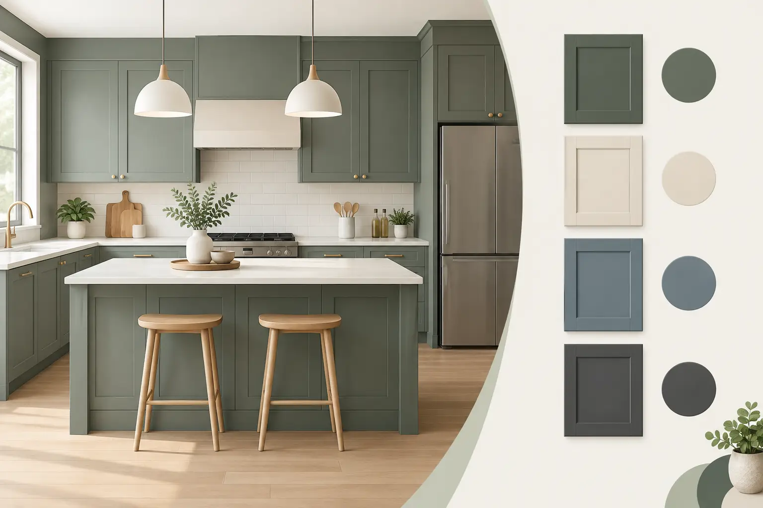
A kitchen can look ‘nearly right’ on paper, then feel unsettled once the new doors are fitted. Usually, the issue is not the door colour on its own. It is how that colour sits alongside the worktop, floor, wall paint, handles and natural light. Good door colour matching brings these elements together, helping you create a new look for your kitchen without starting again.
For homeowners with sound cabinets and a layout that still works, replacement doors are a sensible place to begin. The visible surfaces do most of the design work, but choosing them well means looking at the kitchen as a whole rather than selecting a favourite swatch in isolation.
Start with what is staying
Before choosing a door finish, be clear about the parts of the kitchen that will remain. Your existing units may be hidden behind the doors, but their positions determine where colour appears around the room. More importantly, a worktop, tiled splashback, flooring or large appliance can strongly influence which door colours feel at home.
If the worktop is in good condition and staying, take its tone seriously. A pale marble-effect surface with cool grey veining tends to suit crisp whites, soft greys, dusty blues and some muted greens. A warm wood-effect worktop often sits more comfortably with cream, cashmere, sage, stone or richer painted-look colours. This is not a fixed rule, but it gives you a reliable starting point.
Flooring deserves the same attention. Wood, vinyl and tile can carry warm yellow, red, grey or beige undertones that are easy to miss until a new door colour makes them more obvious. Bring a photo, sample or offcut when you are comparing options. It is far easier to spot a clash before ordering than after the fitting is complete.
Door colour matching is about undertones
Two colours can both be described as grey and still look wrong together. One may have blue undertones, making it cool and clean; another may lean brown or purple, creating a warmer, softer effect. The same applies to white. A bright white door beside a creamy wall can look stark, while a warmer white next to a cool grey worktop can appear yellowed.
This is why small samples need to be viewed together, not one at a time. Place a door sample against the worktop, wall colour and flooring where possible. Stand back, then look again in daylight and under the kitchen lights. The result may surprise you.
Natural light changes colour throughout the day. A north-facing kitchen often benefits from colours with a little warmth, such as soft stone, cashmere or gentle green, because very blue-based greys can feel colder there. A bright south-facing room has more freedom, but strong sunlight can make pale gloss doors particularly reflective and deepen darker shades.
Artificial lighting matters after dark, when many kitchens are used most. Warm white bulbs can make cream and timber tones feel inviting, but may make a cool white door seem less crisp. Cooler lighting can sharpen whites and greys, yet leave warmer colours looking flatter. There is no need to change every light fitting to suit a door, but it should be part of the decision.
Choose contrast or coordination, not an accidental compromise
A coordinated kitchen uses colours that share a similar warmth or coolness. Think matt cashmere doors with a warm light-grey worktop, or a soft sage shaker door with natural oak-style surfaces. The look is calm and forgiving, especially in an open-plan space where the kitchen needs to sit easily alongside the rest of the room.
A contrasting kitchen is more deliberate. Dark blue, deep green or graphite doors can look striking with a pale worktop, light walls and brushed metal handles. The contrast gives clear definition to the cabinetry, although it can feel heavier in a compact or poorly lit kitchen. If you are drawn to a dark colour, consider using it on base cabinets and choosing a lighter shade for wall units, or keeping the worktop and splashback light.
What tends not to work as well is almost matching. For example, a grey door and grey floor that are close in depth but noticeably different in undertone can make the room feel muddled. In that situation, either select a door that relates clearly to the floor or move away from grey and create intentional contrast.
Match the finish as well as the colour
Colour is only one part of the choice. A matt door absorbs light and gives a more understated, contemporary appearance. It is a popular option for homes wanting a calm, modern update, and it can work well in both pale and darker colours. A gloss door reflects more light, which can help a smaller kitchen feel brighter, although reflections and fingerprints may be more noticeable depending on the shade and household routine.
Shaker doors add shadow lines and detail, so they often suit classic, country or transitional kitchens. A simple slab door has a cleaner surface and can make colour feel more prominent. The same soft green may look traditional in a shaker style and much more modern on a handleless-style slab front.
This matters when matching to existing features. Decorative tile, timber flooring and traditional handles may favour a shaker door with a softer painted-look tone. A simple quartz-effect worktop, smooth splashback and integrated appliances can suit a flatter matt finish in white, grey, taupe or a confident dark shade.
Let handles, taps and appliances do their job
Handles are small, but they affect the finished colour scheme more than many people expect. Brushed nickel or stainless steel is versatile and works with most whites, greys, blues and greens. Matt black creates sharper contrast and suits contemporary schemes, particularly with darker doors or pale matt finishes. Brass and warm metallic finishes can bring life to cashmere, stone, green and navy, but are best chosen with the room’s other metal details in mind.
Try not to introduce too many competing finishes. If the tap is brushed brass, a brass-toned handle can look considered. If the appliances have stainless steel trims, brushed nickel handles may be the quieter choice. Perfectly identical metals are not essential, but they should appear intentional rather than random.
A new sink and tap can also help bridge door and worktop colours. For instance, a dark composite sink can tie in with graphite handles or a darker worktop detail, while a stainless-steel sink keeps a pale, practical scheme feeling fresh.
Use samples in the room, not just in the showroom
A showroom is the best place to compare door styles, finishes and larger material samples side by side. It lets you see whether a matt surface has the feel you want, whether a white is warm or cool, and how a particular handle sits against the door. However, your home provides the final test.
Take samples to the kitchen and look at them next to the features that are staying. View them by the window, beneath the cabinets and at the opposite end of the room. Check them in the morning, late afternoon and evening. If two choices still feel equally good, choose the one that works best with the largest fixed surface, usually the worktop or floor.
Photographs can be useful, but do not rely on them for exact colour decisions. Mobile phone cameras adjust brightness and white balance, often making a warm cream appear white or a muted green look grey. A physical sample tells you far more.
A practical route to a confident choice
Start with one anchor: the worktop, floor, splashback or a colour you genuinely want to live with. Then select a door shade that either coordinates with it or contrasts clearly. Only after that should you settle on handles, wall paint and accessories. This order avoids trying to make every item the starting point at once.
It also helps to think about daily life. A busy family kitchen may benefit from a forgiving matt finish and mid-tone colour that is less likely to show every mark. A smaller kitchen may feel more open with lighter doors and a reflective worktop. If you are improving a property for sale, a timeless neutral scheme can be the safest choice. If this is your long-term home, there is more room for a colour that feels personal.
For homeowners around St Neots and Little Paxton, a visit to the showroom makes these decisions much easier. Seeing replacement door colours beside worktops, handles, sinks and taps gives you a clearer picture than an online image ever can. Friendly advice from experienced kitchen specialists can help you narrow down the options while keeping what already works in your kitchen.
The right colour scheme should not feel like a compromise made under pressure. When you can see and compare the materials properly, a refreshed kitchen becomes a manageable improvement – one that feels right every time you walk into the room.