Best Kitchen Door Colours for a Fresh Look
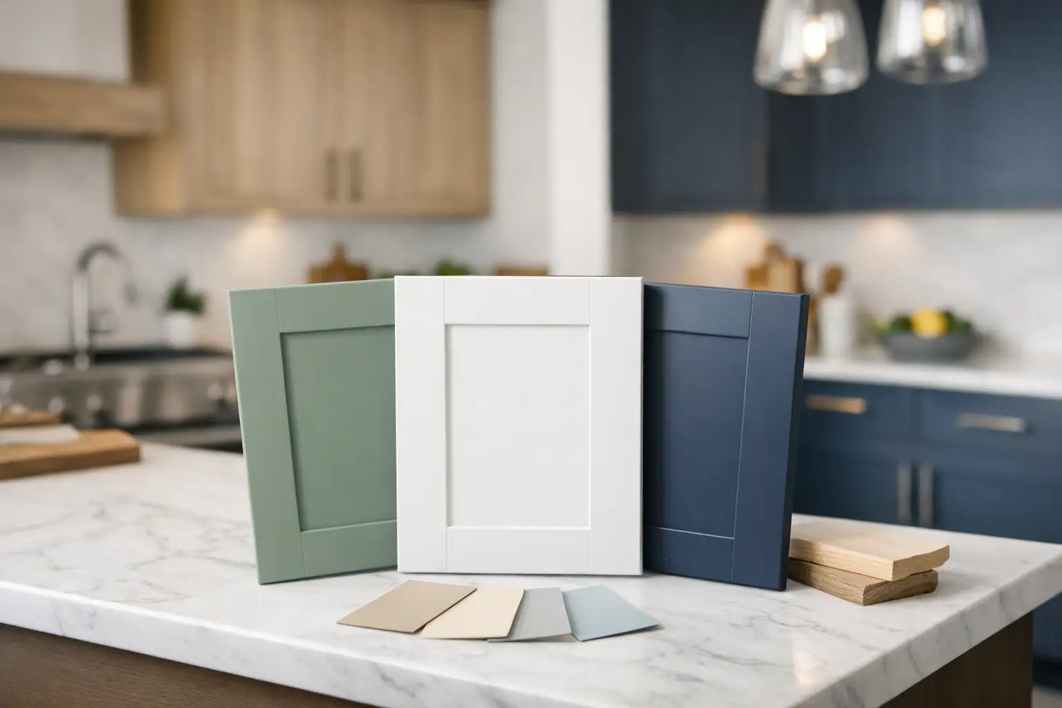
A kitchen can feel dated long before it stops working well. If your cupboards are sound and the layout still suits how you cook, eat and live, replacement fronts can make a remarkable difference. Choosing the best kitchen door colours is often the decision that sets the whole makeover in motion – but the right choice is not always the colour currently filling your social media feed.
The most successful colour is one that works with your room’s natural light, existing features and the amount of day-to-day wear your kitchen receives. It should also feel right when you see it on a full-sized sample, not just a small square on a screen. For homeowners refreshing an existing kitchen, that is where taking a little time at the beginning pays off.
Start with your kitchen, not the latest trend
A colour can look entirely different in a bright south-facing kitchen than it does in a room with a small north-facing window. This matters particularly in many homes around St Neots, Huntingdon and the surrounding villages, where kitchens vary from airy extensions to compact galley rooms in older properties.
Before settling on a shade, look at what will remain. Your flooring, splashback, wall tiles and worktop may all influence the best direction. A warm cream door can sit beautifully with oak-effect flooring, for example, but may look slightly yellow against a cool grey quartz-style worktop. Equally, a blue-grey door may feel calm beside white worktops yet appear chilly in a darker room with little natural daylight.
Try to view samples at different times of day where possible. Morning sun, an overcast afternoon and artificial lighting can all alter how a colour reads. A showroom visit is useful here because you can place door, worktop and handle samples together rather than trying to make separate online images match.
Best kitchen door colours for different homes
There is no single answer to which shade is best. Your kitchen size, door style and personal taste all play a part. However, a few colour families consistently work well for replacement kitchen doors because they offer flexibility and lasting appeal.
Soft whites and warm neutrals
Off-white, ivory, stone and light cashmere are dependable choices for kitchens that need to feel brighter or more open. Unlike a stark brilliant white, these colours have a little warmth, making them easier to pair with existing floors and worktops. They also suit both modern slab doors and more traditional shaker styles.
A pale neutral is especially helpful in a smaller kitchen or one with limited daylight. It reflects light without demanding that every other finish in the room is perfectly matched. The trade-off is that very pale matt doors can show cooking splashes and fingerprints more readily near handles, bins and the hob. Choosing a practical finish and keeping a suitable cleaning routine will help.
Greige, taupe and mid-tone grey
Grey remains popular, but the most useful versions tend to be softer and warmer than the cool, blue-toned greys seen in many kitchens a few years ago. Greige and taupe bring enough depth to define the cabinetry while still feeling relaxed and easy to live with.
Mid-tone colours can be particularly forgiving in busy family kitchens. They disguise the occasional mark better than pure white but do not absorb light like very dark doors. Pair them with brushed nickel, antique brass or black handles depending on whether you want a classic or more contemporary finish.
Sage, olive and muted green
Green kitchen doors have earned their place because they can bring character without feeling overly bold. Soft sage works well in rooms that receive plenty of daylight, while a deeper olive or heritage green can add welcome warmth and depth to a larger kitchen.
Green is often a good option if you have timber flooring, natural-look worktops or a garden view. It sits comfortably alongside those materials. Be mindful of undertones, though. A green with too much grey can look flat in low light, whereas a more yellow-toned green may clash with a cool grey floor. Seeing the door beside your existing samples is the safest way to judge it.
Blue and blue-grey
A muted blue can make a kitchen feel settled and smart, particularly on shaker doors. Dusty blue, slate blue and blue-grey shades are easier to live with than a bright navy and generally complement white, pale stone and wood-effect worktops.
Darker blue can look excellent on a run of base units or an island, with lighter doors elsewhere. In a small kitchen with wall-to-wall cabinetry, however, it may make the room feel enclosed. This is where a two-tone design can offer the character you want without taking away too much light.
Charcoal and near-black
Dark kitchen doors create contrast and can make a simple layout look more considered. Charcoal, graphite and soft black work particularly well with pale worktops, warm timber details and good lighting. They are often a strong choice for a larger open-plan room or a kitchen with wide windows.
The practical consideration is upkeep. Dark matt surfaces can show dust, water marks and fingerprints, particularly around integrated appliance doors. A textured woodgrain or an easier-care finish may be a better fit than an ultra-matt surface if the kitchen is used heavily every day.
Consider two-tone replacement doors
Two colours do not have to mean a complicated design. Using a darker shade on base units and a lighter shade on wall units is a straightforward way to give the kitchen more depth while keeping the room open. Another option is to use one colour for the main cupboards and a contrasting finish for a dresser unit, breakfast bar or island.
This approach is particularly useful when you like a darker colour but are concerned it may overpower the space. Light upper cupboards help maintain brightness, while darker lower units feel grounded and can be more forgiving of everyday knocks and marks.
Keep the contrast purposeful. Two colours that have a similar undertone usually look more coherent than two completely unrelated shades. A warm cashmere with olive green, or soft white with slate blue, can feel balanced. The worktop then becomes the link between them.
Match the colour to your door style and finish
The same colour can look quite different on different door designs. A pale matt slab door gives a clean, contemporary look, while that same shade on a shaker door feels softer and more traditional. Woodgrain-effect doors add texture and can make darker colours appear less flat, while a smooth finish keeps the overall effect simple.
Handles also matter more than many people expect. Slim bar handles can make a traditional shade feel more current, while cup handles and knobs can make it more classic. If you are replacing doors, drawer fronts and handles together, it is easier to create a finished look than if you only change one element.
Do not overlook the worktop. A new door colour can refresh your existing worktop, but sometimes the combination will feel much more complete with a replacement surface as well. Pale doors with a warmer wood-effect worktop are welcoming and practical. Darker doors with a light stone-effect worktop create contrast and help brighten the room.
Make a confident decision before ordering
A sensible colour choice should still appeal after the initial excitement has worn off. Ask yourself whether you want the kitchen to blend calmly with the rest of the home or become a stronger feature. Think about who uses it, how much cleaning you realistically want to do and whether your lighting is likely to change.
It is also worth taking a photograph of your kitchen, including the floor, tiles and worktop, when you go to compare samples. Measurements of your doors and drawer fronts are equally useful, especially if you need made-to-measure replacement doors. A local specialist can help you check proportions and explain which options will work with your existing cabinets.
At Replacement Kitchen Doors To Size in Little Paxton, you can compare door colours, finishes, worktops and handles in person rather than making a costly choice from a small image. For a kitchen that still works well but no longer feels like you, bring a few photos to the showroom and let the samples show you what is possible.