10 Best Quartz Worktop Colours to Choose
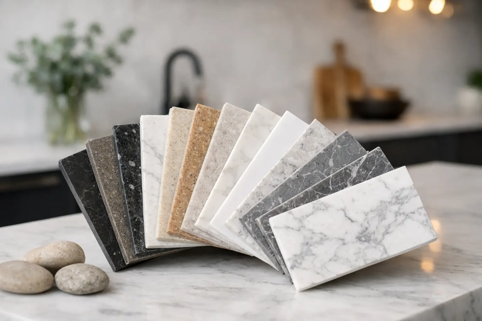
If you are weighing up the best quartz worktop colours, the right answer usually starts with what you are keeping. For many homeowners, the layout already works perfectly well – it is the tired doors, dated worktops or mismatched finishes that make the room feel older than it needs to. Quartz is often the part that brings everything together, but colour choice matters more than people expect.
A quartz worktop is not just a surface. It affects how light the room feels, whether the kitchen looks warm or clinical, how visible crumbs and marks are day to day, and how well your new worktop sits with replacement doors, splashbacks, flooring and handles. A colour that looks excellent in a sample can feel completely different once it is spread across a whole run of cabinets.
How to choose the best quartz worktop colours
The first thing to think about is light. A north-facing kitchen in an older home around St Neots or Huntingdon can feel very different from a bright extension with bifold doors. In darker rooms, pale quartz often helps lift the space, while in very bright kitchens a pure white can sometimes feel a bit stark unless you warm it up with timber tones or softer cabinetry.
The second thing is what sits underneath. If you are refreshing the kitchen you already have rather than starting from scratch, your cabinet style and door colour will guide the decision. A worktop should complement the doors, not fight them. If your new doors are plain and modern, you can afford a little movement or veining in the quartz. If your doors are already quite detailed, a calmer worktop often works better.
Practicality matters as well. Some colours are more forgiving than others. Very dark polished quartz can show dust, fingerprints and water spots more clearly, while very bright whites can make certain marks stand out if the kitchen is heavily used. That does not mean avoiding them – it simply means being honest about how you live.
Best quartz worktop colours for different kitchen styles
1. Crisp white
White remains one of the most popular choices because it is clean, bright and versatile. It works especially well in smaller kitchens where you want the room to feel a bit more open. Paired with shaker doors, it gives a fresh classic look. With slab doors, it feels more contemporary.
The trade-off is that a very flat, brilliant white can sometimes look a touch clinical, especially under cool lighting. If you like the brightness but want something softer, look at warmer whites instead of the brightest option on the rack.
2. Soft white with subtle veining
This is often the safe middle ground, and for good reason. A soft white or off-white quartz with gentle grey or beige veining gives you the lightness of white without looking too stark. It suits both traditional and modern kitchens and tends to sit comfortably with a wide range of door colours.
It is also one of the easier choices if you are replacing doors and worktops together. It gives enough detail to feel interesting, but not so much that you will tire of it quickly.
3. Light grey
Light grey quartz has become a dependable choice for homeowners who want something modern but not too cold. It pairs neatly with white, cashmere, dove grey and even navy doors. If your kitchen already has stainless steel appliances, a grey-based worktop usually ties them in well.
In practical terms, light grey is often forgiving in day-to-day use. It tends to disguise crumbs and light marks better than a stark white, which can make it a sensible family choice.
4. Mid grey
A mid grey worktop adds more definition and can make a kitchen feel grounded. It works particularly well with lighter doors, creating contrast without going as strong as black. In homes where the kitchen opens into a dining area, a mid grey quartz can help the room feel a little more designed and less flat.
That said, it can darken a small kitchen if there is limited natural light. Samples always need viewing in the actual room conditions where possible, not just under showroom lighting.
5. Charcoal or near-black
Dark quartz can look striking, especially with pale doors, brass handles or timber details. If you want a kitchen refresh that feels more current without changing the layout, charcoal is often a good way to add contrast and depth.
The practical compromise is upkeep. Dark polished surfaces can show dust, smears and dried water more readily. A softer finish or a gently flecked pattern can help, but this is still usually better suited to people who do not mind a quick wipe-down.
6. Warm beige or stone
Not every kitchen suits grey. In homes with warmer flooring, cream walls or oak-style doors, a beige or stone-toned quartz often feels more settled and natural. It can soften the whole room and stop a makeover from looking too sharp or too trendy.
This is a particularly useful direction if you are updating an older property and want the new worktop to feel in keeping rather than overly sleek.
7. Cream
Cream quartz is quieter than white and works well in classic kitchens. If you are choosing replacement shaker doors in ivory, cashmere or a painted heritage shade, cream can be the better fit. It keeps the kitchen light but adds warmth.
The main thing to watch is undertone. Some creams lean yellow, others lean grey. That is why seeing a larger sample beside your chosen doors is so helpful.
8. Marble-effect quartz
Marble-effect designs remain popular because they offer movement and character without the maintenance concerns that put some people off natural stone. They can look elegant, but the scale of the veining matters. Fine, subtle veining tends to age better in everyday kitchens than very bold patterns.
If you are refreshing an existing kitchen rather than building a large new one, choose the pattern with care. In a modest-sized room, dramatic veining can dominate more quickly than expected.
9. Concrete-effect quartz
For a more modern, understated look, concrete-effect quartz has real appeal. It works nicely with matt doors, handleless styles and industrial-inspired schemes, but it can also add contrast in a period home if used carefully.
This is not always the best route if you want a timeless, easy-to-match finish. It can be a little more style-led, so it helps to be confident that the rest of your choices support it.
10. Taupe and greige tones
Taupe and greige sit between grey and beige, which makes them very adaptable. They are useful when a kitchen has both warm and cool elements and you need a worktop colour that bridges the gap. These shades often suit replacement kitchen projects because they work with more existing features, from flooring to wall colour.
If you are struggling to choose between grey and cream, this is usually the area worth looking at.
What works best with popular door colours
White doors and quartz worktops are a classic pairing, but the result depends on contrast. White doors with white quartz create a clean, airy kitchen, while white doors with grey or charcoal quartz add more definition. Neither is right or wrong – it depends on whether you want the room to feel soft or structured.
Cashmere and cream doors often suit warmer quartz shades, including soft white, beige and greige. These combinations tend to feel calm and easy to live with. Grey doors are more flexible than people think and can work with white, marble-effect, mid grey or even darker quartz if the room has enough light.
Navy, graphite and deep green doors usually benefit from lighter worktops to keep balance, although a dark-on-dark look can work in larger spaces with good natural light. Wood-effect doors often pair best with quartz that has warmth rather than anything too blue or stark.
Why showroom viewing makes colour choice easier
Quartz is one of those products that really benefits from being seen properly. A mobile phone screen flattens tone, changes warmth and rarely shows the true scale of pattern. Even a small sample can be misleading if you do not compare it against your door colour, flooring and the light in your kitchen.
That is why many homeowners find it easier to narrow things down in person. Seeing samples side by side helps you spot whether a white is too cold, whether a grey looks too purple, or whether a veined design feels busy once it is next to your chosen replacement doors. At Replacement Kitchen Doors To Size, that practical comparison is often what turns a vague idea into a confident decision.
The best quartz worktop colours are not simply the most fashionable ones. They are the shades that suit your light, your doors, your daily routine and the kitchen you already have. If you are unsure, start with what needs to stay, compare samples properly, and choose the colour that still looks right when the novelty has worn off.