Kitchen Colour Trends 2026 for Real Homes
If you are looking ahead to kitchen colour trends 2026, the biggest shift is not towards louder kitchens or colder minimal schemes. It is towards colours that feel settled, liveable and easier to keep for years. For many homeowners, that is good news. You do not need to rip everything out to bring your kitchen up to date. In plenty of cases, changing doors, drawer fronts, worktops and finishing touches is enough to give the whole room a fresher feel.
That matters if your layout already works well. A kitchen can be perfectly practical but still look tired because the colours are dated, the finish is worn or the room feels too stark. The colour direction for 2026 suits exactly that sort of update. It is less about chasing a fashion and more about choosing shades that soften the room, add warmth and sit comfortably with the rest of the house.
Kitchen colour trends 2026 are getting warmer
For a while, many kitchens leaned heavily on cool greys, bright whites and high-contrast black details. Some still look smart, but many now feel a bit flat, especially in homes where the kitchen is used all day and needs to feel welcoming rather than showroom-sharp.
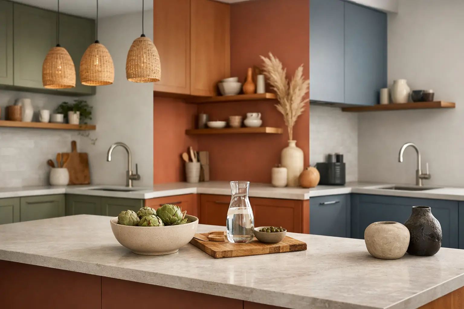
In 2026, warmer neutrals are taking over. Think soft stone, putty, mushroom, oat, clay and taupe rather than brilliant white or blue-based grey. These shades are easier on the eye and work well in British light, which can make colder colours feel harsher than expected.
This does not mean beige is back in the old-fashioned sense. The newer warm neutrals have more depth. They work with timber, brushed metal, marble-effect worktops and painted walls without making the room feel heavy. If you want a safe update that still feels current, this is probably the most dependable route.
Green is staying, but becoming more grounded
Green has been popular for several years, and it is not disappearing. What is changing is the type of green people are choosing. The brighter botanical shades are giving way to more muted, earthy versions – olive, moss, sage with grey-brown undertones, and deeper heritage greens.
These colours suit kitchen makeovers particularly well because they sit nicely with existing flooring, neutral tiles and wood accents. If you are keeping your cabinets in the same layout and simply replacing the fronts, green can add character without making the room feel drastically different.
Lighter greens are useful in smaller kitchens or rooms with less natural light, while deeper greens can work beautifully on base units or island areas. The trade-off is that very dark greens can make a narrow kitchen feel more enclosed, so balance matters. Pairing a darker lower section with lighter wall units or a lighter worktop often keeps the room feeling open.
Earthy reds, browns and plaster tones are emerging
One of the more interesting kitchen colour trends 2026 brings in is the rise of earthy warmth. Terracotta, muted rust, plaster pink, cocoa and soft brown tones are appearing more often, though usually in a restrained way.
For most homeowners, these are not colours to use across every cabinet door unless the room really suits them. They tend to work better as part of a balanced palette – perhaps on a feature run of units, a pantry area or alongside warm neutral cabinetry. Used carefully, they can make a kitchen feel more individual and less copied from a brochure.
This trend is especially useful if your home has warmer flooring, brick elements or period details. In newer homes, it can also soften kitchens that otherwise feel slightly clinical. The key is to keep the undertones consistent. A clay-toned door next to a pink-beige wall and an orange oak floor can become muddled quite quickly if the shades are not properly compared in person.
Blue is still around, but less icy
Blue remains a reliable kitchen colour, especially for people who want something classic. The change for 2026 is that softer, smokier blues are doing better than very bright navy or crisp coastal shades.
Dusty blue, mineral blue and blue-grey with a touch of warmth tend to feel more current. They still give colour, but they do not dominate the room in the same way. If your kitchen is connected to a dining or family space, these toned-down blues are often easier to live with because they blend into the wider home rather than announcing themselves.
As with green, darker blue can be useful on lower cabinets and lighter shades on top. That is often a sensible choice if you want contrast without making the room feel top-heavy.
Matt finishes are leading over high gloss
Colour is only part of the story. Finish changes how a colour reads. In 2026, matt and smooth super-matt finishes are still leading, with woodgrain textures and painted-look surfaces also staying strong.
This suits kitchen refreshes because a matt finish tends to make colours look calmer and more expensive without being flashy. Warm taupe in a matt finish feels very different from the same shade in a reflective gloss.
That said, gloss has not vanished altogether. In small, darker kitchens it can still help bounce light around. The practical question is whether you prefer that sharper, more polished appearance or a softer look that hides fingerprints a little better. It depends on the room and how you use it.
Two-tone kitchens are becoming more subtle
Two-tone kitchens are not new, but they are changing. Instead of strong contrasts such as white wall units and almost-black base units, 2026 is leaning towards gentler combinations. That might mean mushroom and olive, stone and clay, or warm ivory with soft woodgrain.
This is good news if you want interest without a kitchen that dates quickly. Subtle contrast adds shape to the room while keeping the overall feel calm. It also gives you more flexibility when choosing handles, wall colour and worktops.
For homeowners refreshing an existing kitchen, two-tone schemes can be a very practical answer. If you are unsure about committing to a full run of colour, keeping some sections lighter can make the decision easier.
What actually works in everyday kitchens
Trends are useful, but the right colour still depends on the room you have. A large bright kitchen can carry deeper shades much more comfortably than a narrow galley kitchen with one small window. Likewise, a family kitchen that gets heavy daily use may suit a more forgiving colour and finish than a rarely used room.
That is why samples matter. A colour that looks soft under showroom lighting or on a phone screen can turn yellow, flat or greenish once it is next to your floor, wall paint and worktop. Seeing finishes properly and comparing them side by side usually saves people from costly mistakes.
If you are keeping your carcasses and changing the visible parts, it also helps to think beyond the doors themselves. A new colour often looks best when it is supported by updated handles, a more current worktop and a tap or sink that does not belong to a completely different style era. You do not always need to change everything, but the final look is usually stronger when the details feel considered.
How to use 2026 colours without replacing the whole kitchen
This is where the current trends are especially useful. Most of the leading shades for 2026 are flexible enough to work in a makeover rather than a full renovation. If your units are sound and your layout makes sense, replacing doors and drawer fronts can do most of the visual work.
A dated oak-effect kitchen, for example, can be transformed with warm neutral shaker doors, new handles and a lighter worktop. A plain off-white kitchen can feel far more current with olive or taupe replacement doors and a few better chosen finishing touches. Even a kitchen that still functions well but looks a bit tired can often be brought back with colour and materials rather than a complete strip-out.
That is one reason many local homeowners visit a showroom before making a decision. It is much easier to judge whether a green is too dark, whether a taupe pulls too pink, or whether a matt finish suits your household when you can see full-size samples and compare combinations properly. At Replacement Kitchen Doors To Size in Little Paxton, that practical side of the process matters just as much as the style itself.
Choosing a colour you will still like in five years
The safest way to approach kitchen colour trends 2026 is not to ask which colour is most fashionable. A better question is which colour will still feel right in your home once the trend headlines move on.
Warm neutrals are likely to last because they are easy to live with. Muted greens and softened blues also have staying power because they sit somewhere between classic and current. The more expressive earthy tones can be brilliant, but they usually work best when used with a bit of restraint.
If you are torn between something bold and something safer, there is a middle ground. Choose a steadier cabinet colour, then bring in stronger tones through wall paint, stools, small appliances or decorative pieces that are easier to change later.
The best kitchen updates usually come from matching colour to the room, the light and the way you actually live. Get that right, and the kitchen you already have can feel surprisingly new.